Dolcori Forest Brand Identity
OVER VIEW
‘돌코리숲(Dolcori Forest)’은 제주의 독특한 전설인 ‘돌코냉이’ 설화에서 영감을 얻은 새로운 세계관을 바탕으로 2026년에 개장한 대규모 고양이 테마파크입니다. 이곳은 단순히 빠르게 둘러보고 떠나는 관광지가 아니라, 방문객이 각자의 속도에 맞춰 자유롭게 거닐며 휴식을 취할 수 있도록 설계된 체험형 관광 명소입니다. ‘그라프(Graph)’와의 협업을 통해 브랜드 정체성과 세계관을 확립했으며, 다섯 가지 고양이 캐릭터 IP도 함께 개발했습니다.
Dolcori Forest is a large-scale cat-themed theme park that opened in 2026, featuring a new worldview inspired by the Dolkonaengi myth, a unique legend of Jeju. Rather than a tourist destination where visitors consume quickly and move on, it is an experiential tourist spot designed to allow visitors to freely stroll and relax at their own pace. Through a collaboration with Graph, the brand identity and worldview were established, and five cat character IPs were created.
Logo & Symbol
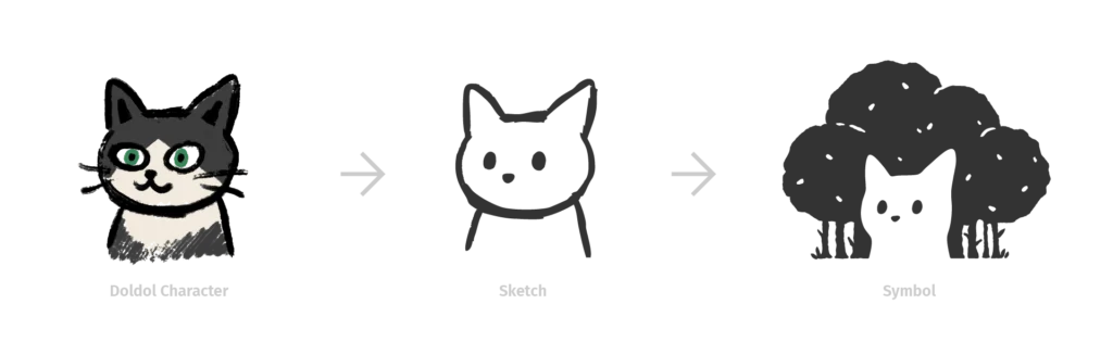
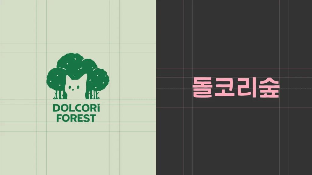
돌코리숲의 심볼은 둥글게 둘러싼 나무의 실루엣은 숲의 포근한 이미지를, 그 안에 자리한 고양이의 얼굴은 돌코리숲에서 살고 있는 존재이자 관찰자의 시선을 상징합니다. 로고는 한글, 영문 2가지 타입이 있으며 볼드하고 판화풍의 타이포로서, 나무를 깎아 만든 듯한 모양새가 심볼과 자연스럽게 어울리는 느낌으로 제작되었습니다. 심볼과 로고에 사용된 고양이의 얼굴은 메인 캐릭터인 돌돌이의 얼굴에서 파생되었습니다.
The symbol of Dolcori Forest features a circular silhouette of trees that conveys the cozy image of the forest, while the cat’s face nestled within symbolizes the inhabitants of Dolcori Forest as well as the observer’s gaze. The logo is available in both Korean and English versions and features bold, printmaking-style typography designed to naturally harmonize with the symbol through its carved wood-like appearance. The cat’s face used in both the symbol and logo is derived from the face of the main character, Doldol.
Color
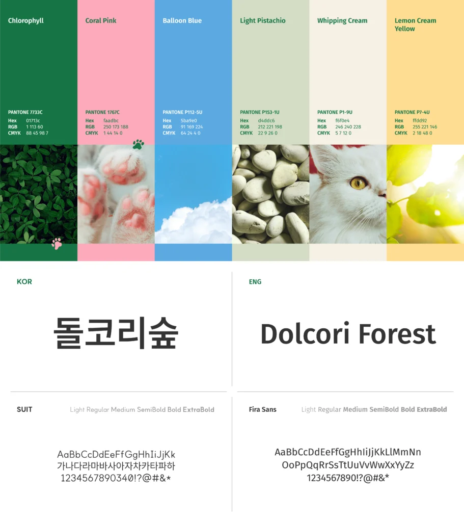
이 색상 조합은 ‘고양이가 사는 숲’이라는 돌코리숲의 세계관을 자연스럽게 떠올리게 합니다. 각 색상은 식물, 고양이 발바닥, 하늘, 조약돌, 고양이 털, 그리고 햇빛에서 영감을 얻었습니다.
This color combination naturally evokes Dolcori Forest’s worldview of a “forest where cats live.” Each color was inspired by plants, cat paws, the sky, pebbles, cat fur, and sunlight.
Graphic Motif
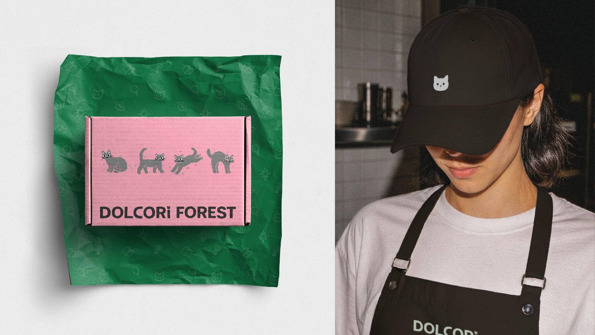
그래픽 모티프는 ‘고양이가 사는 숲’에서 영감을 얻은 브랜드 심볼과 영문 로고를 바탕으로 개발되었습니다. 브랜드의 주요 고양이 캐릭터 5종을 상징하는 요소를 활용한 6가지 모티프는 서로 조합하여 사용할 수도 있습니다. 이러한 모티프는 브랜드를 접하고 이용하는 모든 소비자에게 일관된 경험과 학습 환경을 제공하도록 설계되었습니다.
The graphic motifs are derived from the brand symbol and English logo, which were inspired by the ‘Forest Where Cats Live.’ Six motifs utilizing the representative symbols of the brand’s five main cat characters can also be combined. These motifs are designed to provide a consistent experience and learning environment for all consumers who encounter and use the brand.

Map Design
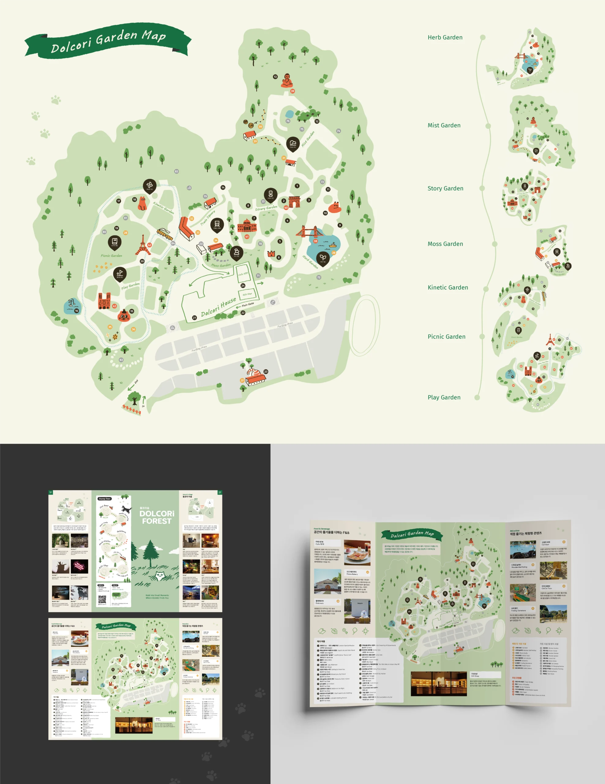
이것은 돌코리숲의 가든맵 디자인입니다. 일러스트 형태의 지도로서 가든의 주요 명소와 예술 작품을 묘사하여 위치를 안내하고 시각적 혼란을 최소화합니다. 또한 구역별로 구분할 수 있어 각 가든에 지도 안내판을 설치하기에 용이합니다.
This is the garden map design for Dolcori Forest. As an illustration-type map, it depicts landmarks and artworks within the garden to provide location guidance and minimize visual confusion. Additionally, since it can be divided by zone, it facilitates the installation of map signage in each garden.
Signage
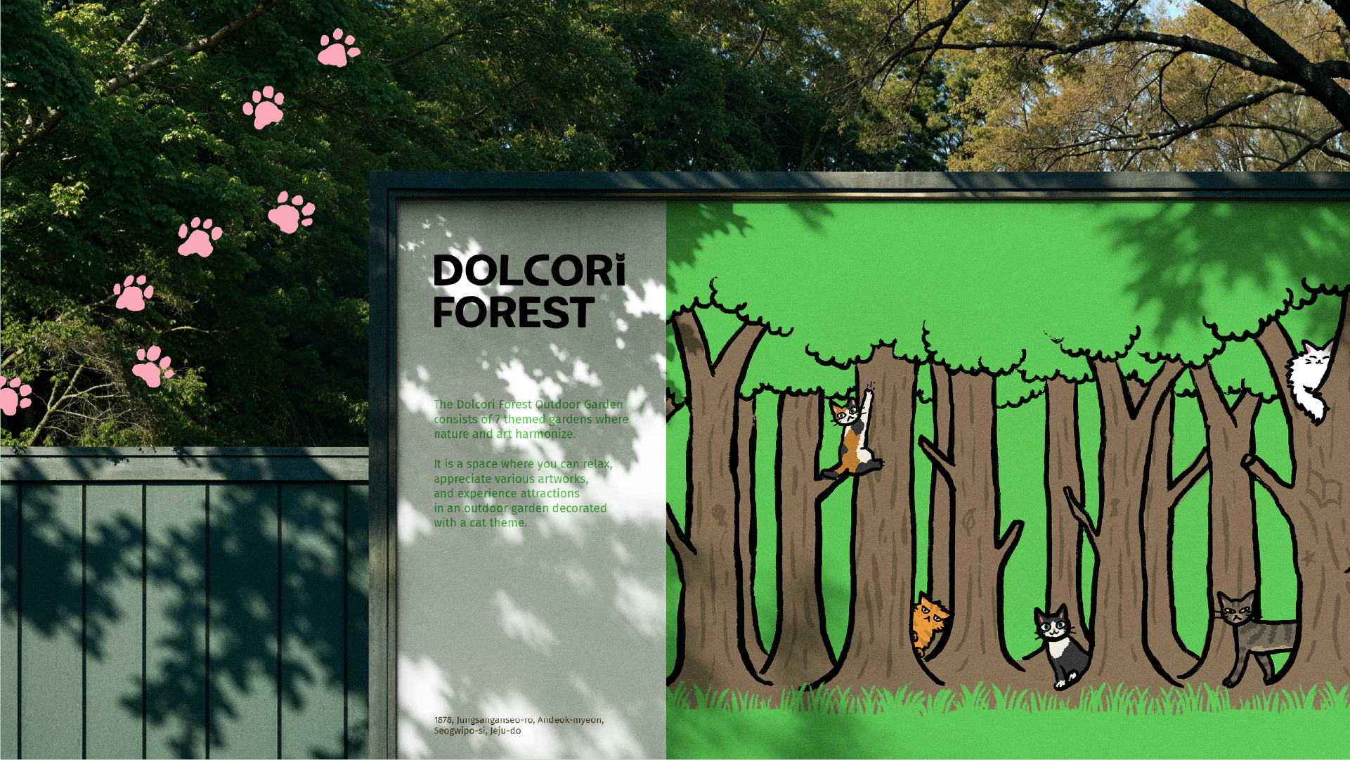
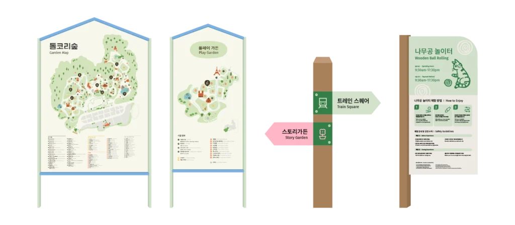
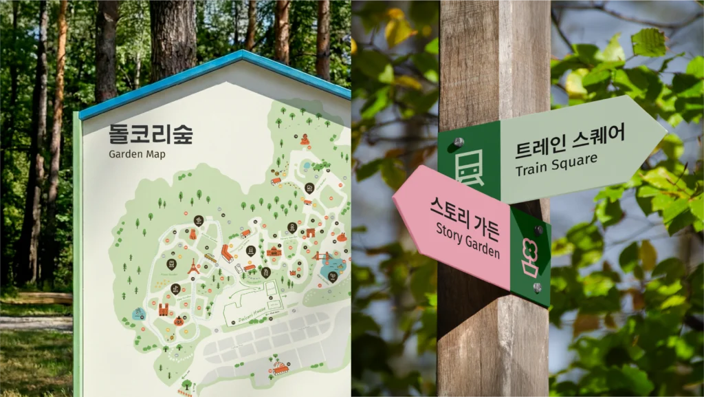
돌코리숲은 자연으로 둘러싸인 관광지이므로, 주변 환경과의 조화를 위해 정교하고 매끄러운 그래픽 대신 손으로 그린 일러스트를 사용했습니다. 위치 전달이 중요한 안내 표지판에는 단순화된 아이콘을 적용했습니다.
Dolcori Forest is a tourist destination surrounded by nature; therefore, hand-drawn illustrations—rather than polished, precise graphics—are used to ensure harmony with the environment. For signage where conveying location is crucial, simplified icons are employed.
F&B Branding
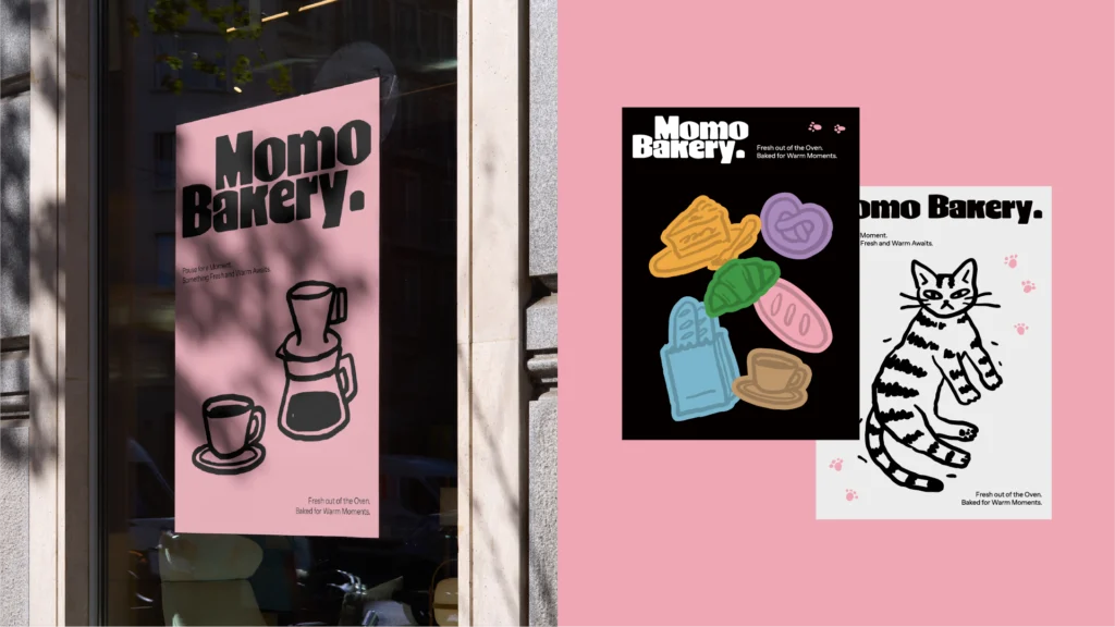
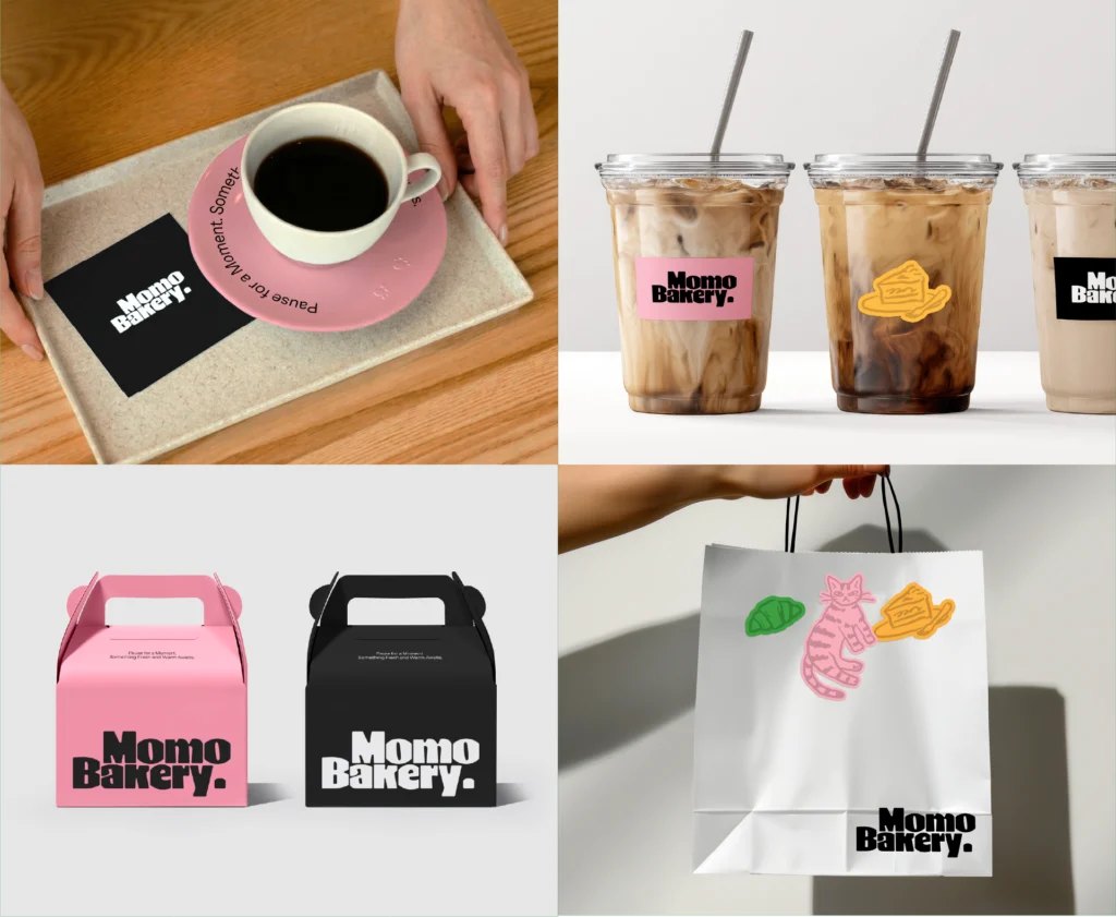
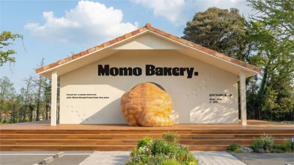
전시장 외부에 위치한 모모 베이커리(Momo Bakery)의 전반적인 브랜딩을 진행했습니다. 모모라는 고양이가 갓 구운 빵을 내어준다는 콘셉트를 바탕으로, 대표 메뉴인 식빵의 부드럽고 풍부한 질감을 타이포그래피를 통해 표현했습니다.
We handled the overall branding for Momo Bakery, located outside the exhibition hall. As a brand based on the concept of a cat named Momo serving freshly baked bread, We expressed the soft and rich texture of the main menu item, sliced bread, through the typography.
현대적인 블랙 앤 화이트 색상을 메인으로, 색이 없는 선화 일러스트와 조합됩니다. 코랄 핑크가 포인트 컬러로 사용됩니다.
Featuring modern black and white colors as the main palette, it is combined with colorless line art illustrations. Coral pink is used as an accent color.